
Lush Perspectives
Branding, Social Strategy
August 14, 2018
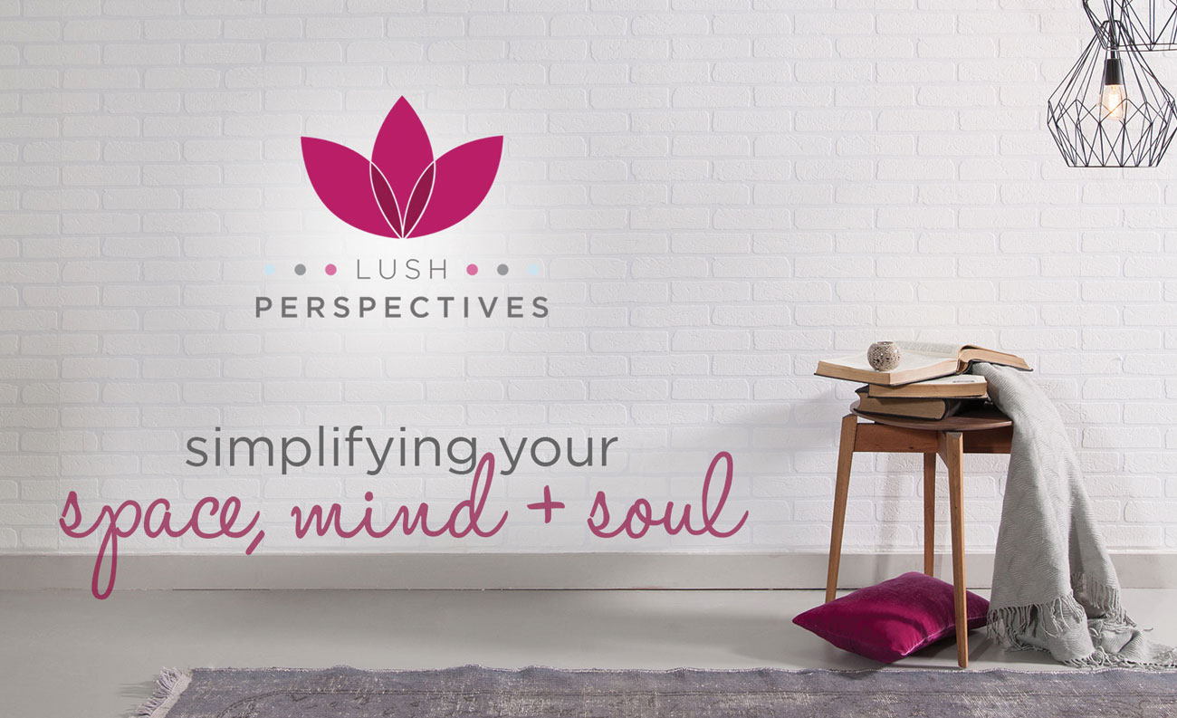
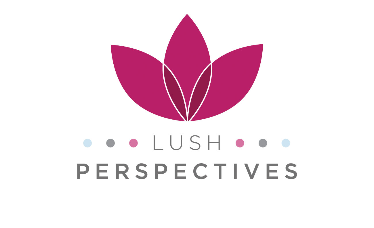
Lush Perspectives is a long-established company which assists people develop and refine their home, work and mental well-being. The methodologies used by the business to assist individuals are based on scientific research into how the brain works and neuro-pathway research.
The business had been using a brand which featured flowers and a red, blue and grey colour palette. We were approached to refine and modernise the brand to better reflect the brand goals and abilities.
We decided to retain the colour palette and flower imagery to retain a link to the previous brand, but with a fresh approach.
The triad – or series of three – features heavily in the way the business structures its services; from the three key areas it focuses on (home, health, work); to the way in which learning materials are structured. As a result, we incorporated three colours which could be used to identify core learning areas, along with three dots within the logo.


